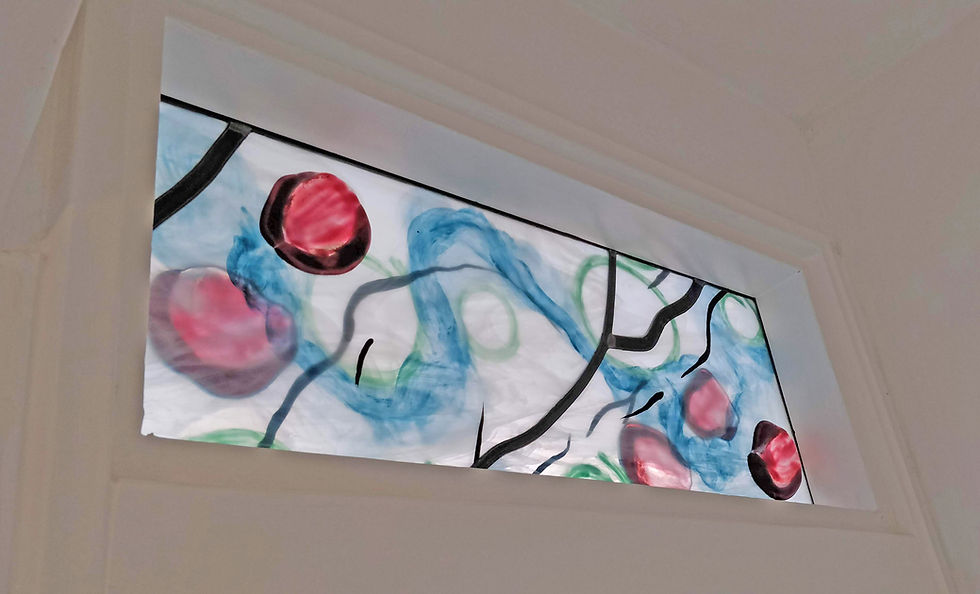
Window art for a family home
- Evelien de Bruijn

- Jul 30, 2019
- 3 min read

This spring I worked on an assignment for a family who had just moved to a new home. The house was originally built in the 1950’s, with little changes over the years. The couple decided to bring the place up to date. They tore down the wall between the kitchen and the living room and made a new door to the hallway. Above this door was room for a window.
Looking for inspiration
I really like the improvements they made. Also the decoration of the house is really nice. They have some beautiful paintings on the wall, made by their mothers. I especially liked one of the watercolours. Both the house and the painting became an inspiration for my design.

Spring Creek
As an artist, you’re supposed to be drawing and painting every day. I have to admit that it doesn’t apply to me. Sometimes I am just to busy with work or family, or I am just too tired! Bad artist! But every now and again I manage to find a quiet moment to mess around with crayons and paint. One day I was making some small doodles on paintings when I saw something I liked. I picked up a new piece of paper and painted it again. I knew I found the design for this family. It looked like a streaming creek, with flower petals floating on the surface. I called it ‘Spring Creek’.
I always think of different ways I can make a design in glass
Fortunately, my clients like my design. Now I had to get to work. I always think of different ways I can make a design in glass. This time I wanted the window to be nice to look at from both sides. I also wanted the design to be visible without backlight. The window is inside a building, so there is less natural light during the day. I chose to use half clear, half opaque glass by Spectrum/Oceanside. The petals would be glued on both sides of the window.
To test the paint
I wanted to paint on both sides of the glass. With contour paint, this is no problem, but with the coloured paints it doesn’t always work. Sometimes the paint on the bottom side sticks to the shelf in the kiln. Also I wanted to create a watercolour effect. I needed to test that as well. To test the paint I made three samples on the same kind of glass I was planning on using. After firing them once, I turned them upside down and fired again. I put fresh shelf primer by Bullseye on the shelf. I was pleased with the results: only where the paint was thick, it was a little damaged.

Painting both sides adds depth and makes the window change under different lighting
Eventually I made the window like this: I painted contour and coloured paints on both sides of five pieces of glass. Painting both sides adds depth and makes the window change under different lighting. These pieces I put in lead to make the complete panel. I also used different sizes of lead, to match the different thicknesses of the painted contour lines. Now all that was left were the purple petals.
Getting the balance between the glass powder and fusing paint right
I made a couple of tests with clear glass, fusing paint, glass powder and purple glass. I needed a couple of samples to get the balance between the glass powder and fusing paint right. When I was pleased with the results I assembled all petals and put them in the kiln. I full fused them, using Oceanside COE96 glass. Finally I glued them with Wacker SilGel onto the window and the panel was finished.

Small, but very rewarding
I was very curious how it would look at its final destination. This was a small project, but very rewarding. The family was happy, and happy customers make me very happy! My next adventure will bring me a bit more back to my roots: interior and furniture design. More on that next time…


Comments